19 Two-Tone Techniques That Create Stunning Contrast
In a world saturated with color, sometimes the most powerful statement is made with just two. Two-tone design isn’t a trend; it’s a timeless principle rooted in the fundamental power of contrast. It’s the visual tension between light and dark, warm and cool, bold and subtle that captures the eye and creates unforgettable impressions.
1. The Classic Horizontal Split
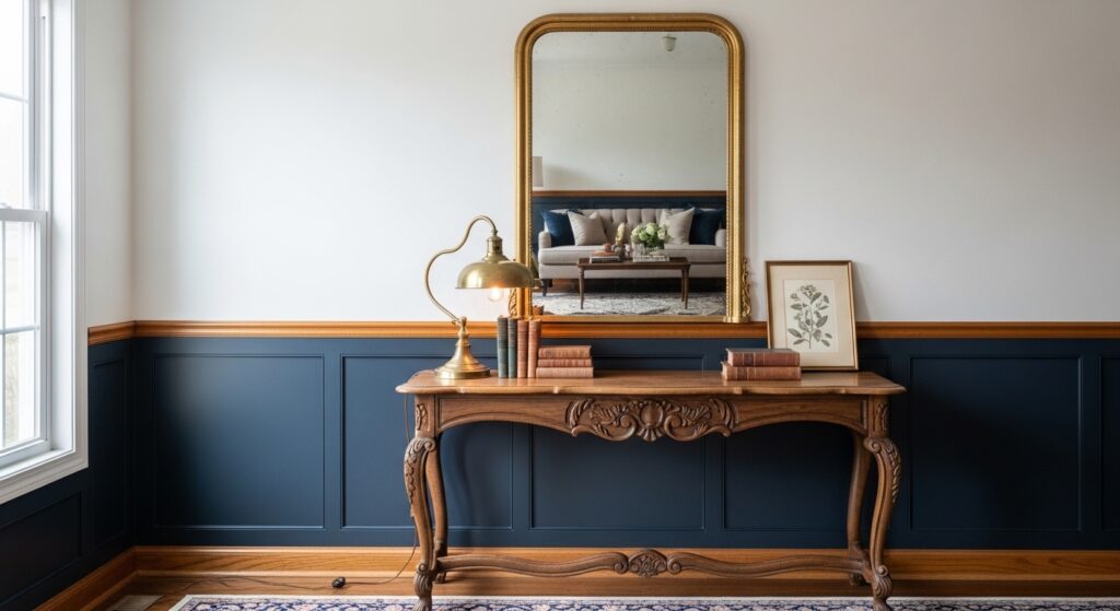
Perhaps the most recognizable technique, the horizontal split uses a strong line—often at chair-rail or picture-rail height—to divide a wall into two distinct color fields. This method is exceptionally effective for adding architectural interest to plain rooms, lowering or raising ceiling heights visually, and creating a grounded, traditional feel. Using a darker shade on the bottom grounds the space, while a lighter top feels airy and expansive.
2. Vertical Division for Height
Flip the script with vertical two-tone application. Painting or designing in vertical sections can dramatically elongate a space, making low ceilings feel taller. This technique works wonders in narrow hallways, small bathrooms, or on feature walls behind beds and sofas. It guides the eye upward and can be used to frame specific pieces of furniture or artwork with a colored backdrop.
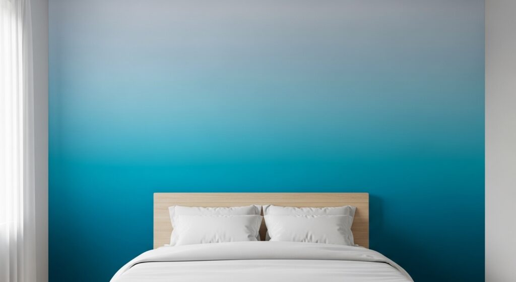
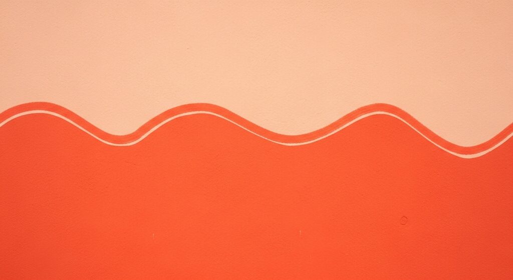
3. The Ombré Fade
Two-tone doesn’t require a hard line. The ombré technique creates a stunning, gradual transition from one color to a tint or shade of itself, or to a completely different hue. This creates a soft, ethereal, and sophisticated contrast that feels organic and artistic. It’s perfect for creating a focal wall with a dreamy, sunset-like effect or adding depth to textiles and digital backgrounds.
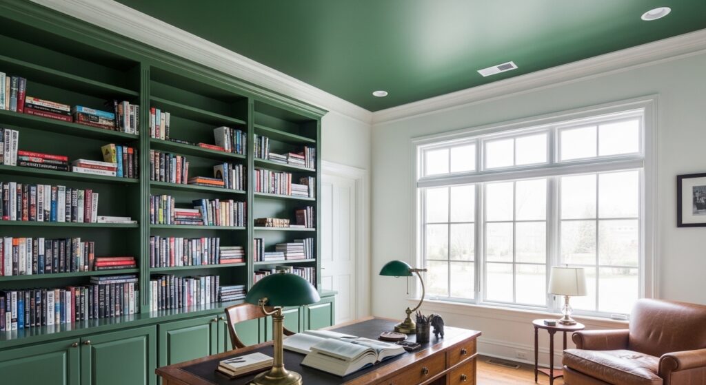
4. Ceiling as the Fifth Wall
Don’t neglect the ceiling! Painting the ceiling a different color than the walls instantly defines the volume of a room. A dark ceiling can feel cozy and intimate, drawing the space downward, while a brightly colored ceiling can feel playful and unexpected. Contrasting trim at the crown molding intersection sharpens the effect beautifully.
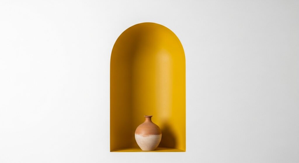
5. Architectural Element Highlight
Use two tones to celebrate a room’s architecture. Paint built-in shelves, window frames, fireplace surrounds, or archways in a contrasting color to the main wall. This technique outlines and celebrates these features, turning them into intentional art pieces. It’s a fantastic way to add character to modern, boxy spaces by creating false architectural interest.
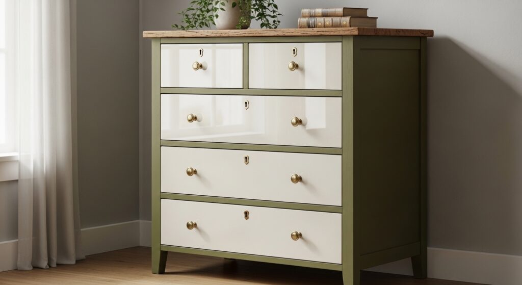
6. Furniture as a Two-Tone Statement
Two-tone isn’t just for walls. Furniture offers a mobile canvas for contrast. Think of cabinets with differently colored bases and doors, a table with a contrasting tabletop and legs, or a sofa with a frame in one finish and cushions in a starkly different fabric. This approach adds layered sophistication and allows for flexible styling.
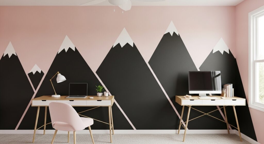
7. Geometric Blocking
Move beyond straight lines with geometric shapes. Triangles, circles, squares, or organic shapes painted in two contrasting colors create a dynamic, modern, and graphic feel. This is a bold technique that works best as a focal point. It’s highly effective in children’s rooms, creative studios, and commercial spaces wanting to project energy and innovation.
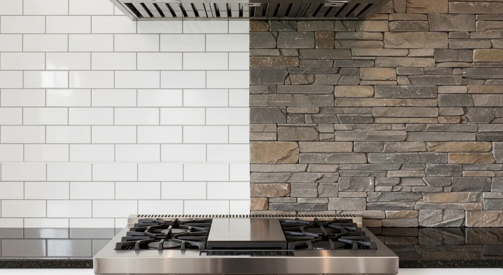
8. Material Contrast (The Ultimate Two-Tone)
Two-tone contrast isn’t limited to paint. The interplay of different materials creates a rich, tactile experience. Think wood and metal, glossy tile and matte plaster, rough brick and smooth glass. This technique builds depth and interest that color alone cannot achieve, appealing to multiple senses and creating a high-design feel.
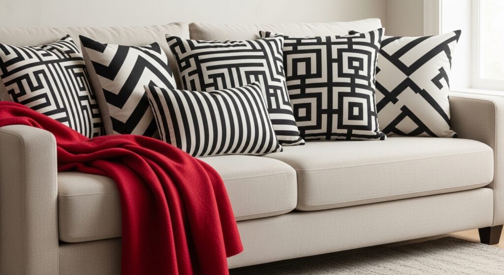
9. Textile Layering
In fashion and interior soft furnishings, two-tone effects come alive through textiles. A duvet cover with a contrasting interior, a dress with reverse color lining on the lapels, or curtains with a bold band of contrast fabric along the edges. This reveals surprising details upon movement or interaction, adding a layer of discovery and luxury.
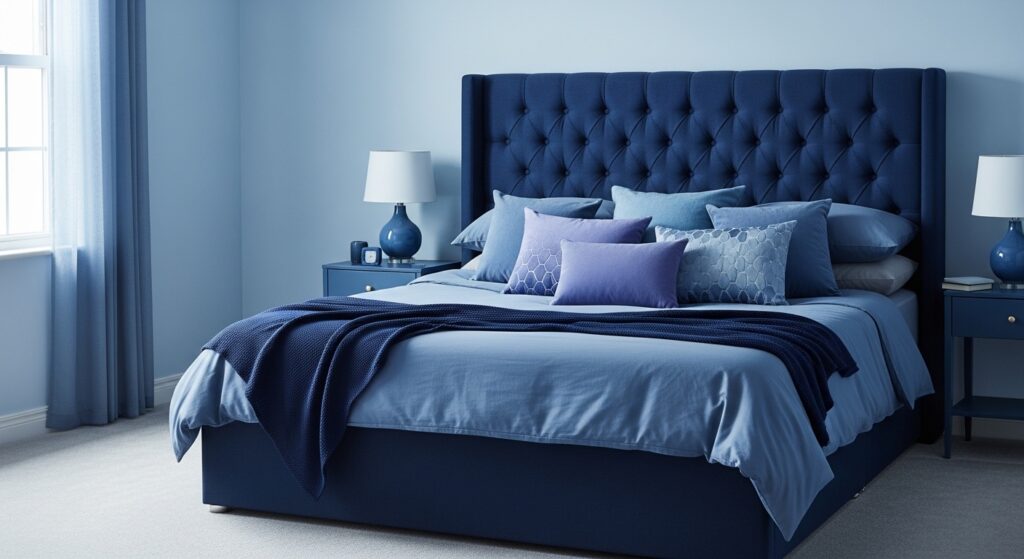
10. Light vs. Dark Monochrome
For a supremely elegant and cohesive look, stay within a single color family but play with extreme value contrast. A room decorated in varying shades of grey, from near-white to charcoal, feels unified yet deeply dimensional. This is a masterclass in using tone rather than hue to create visual separation and interest.
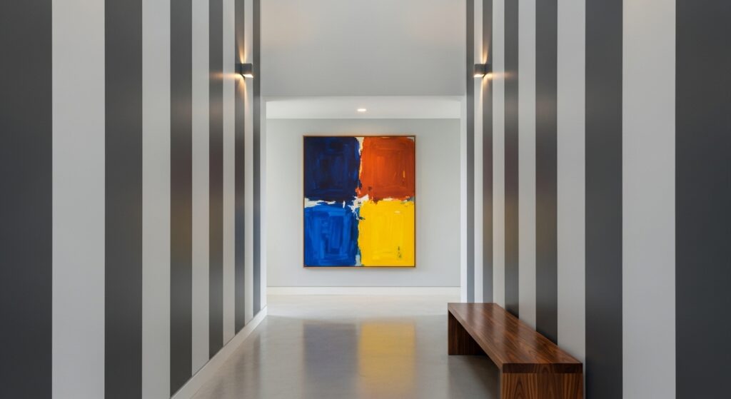
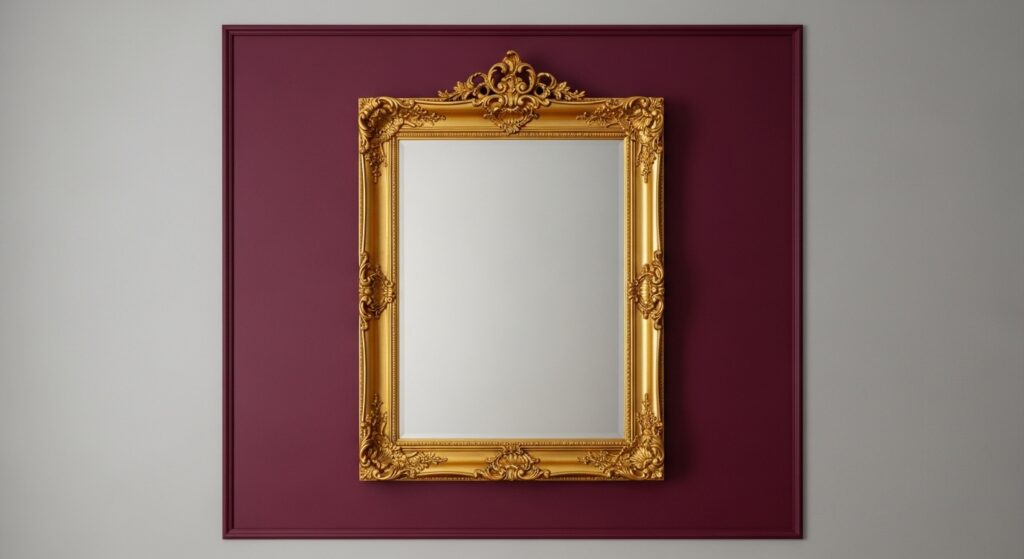
11. Frame Within a Frame
Create a concentrated burst of contrast by painting a large rectangle or square on a wall in a contrasting color, then placing artwork or a mirror within it. This double-framing effect amplifies the importance of the object inside and creates a graphic, gallery-like feel on any wall.
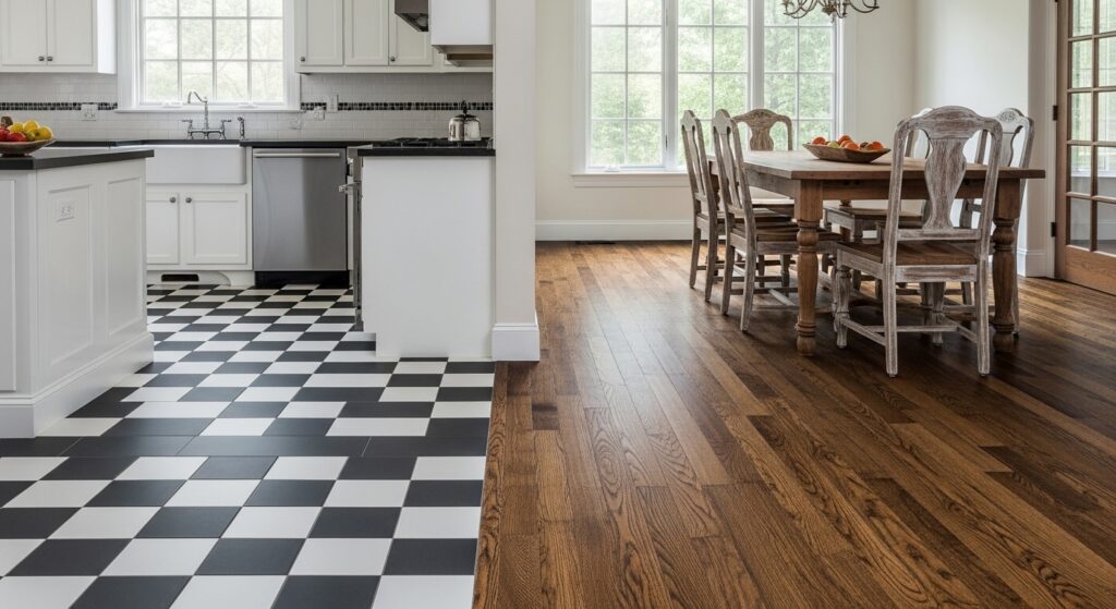
12. Two-Tone Flooring
Make a ground-level statement with contrasting floors. This can be achieved with patterned tiles (like checkerboard), using two different stains on hardwood in a parquet or border pattern, or with strategic rug placement. It defines zones in an open-plan space and adds a foundational layer of pattern.
13. Saturated vs. Pastel
Pair a highly saturated, vibrant color with its soft, pastel counterpart. The energy of the bold color is balanced by the calm of the pastel, creating a look that is both lively and serene. Think emerald green with mint, or cobalt blue with sky blue. This technique is playful yet refined.
14. Warm vs. Cool Contrast
This is color theory in action. Placing a warm color (like terracotta, mustard) directly against a cool color (like sage green, steel blue) creates a vibrant, energetic tension that makes both hues appear more vivid. It’s a dynamic way to energize a space or design.

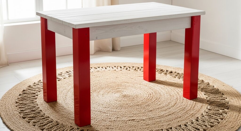
15. The Popsicle Legs Trend
A specific and charming furniture technique: painting the legs of tables, chairs, or benches in a bright, contrasting color to a neutral body. This adds a subtle, playful touch of color that enlivens a space without overwhelming it. It’s an easy DIY update with major impact.
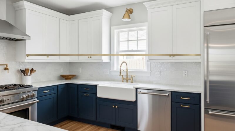
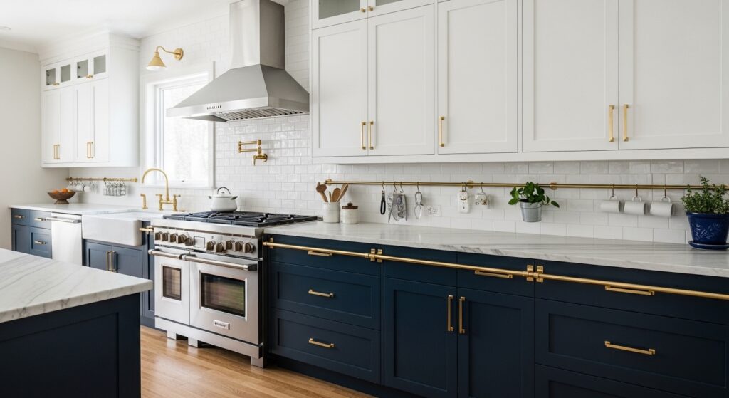
16. Two-Tone Cabinetry
A leading trend in kitchens and bathrooms is using two different colors for upper and lower cabinets. Typically, darker bases ground the space, while lighter uppers keep it feeling open. Alternatively, use a bold color on an island or a pantry cabinet to create a focal point amidst a sea of neutral units.
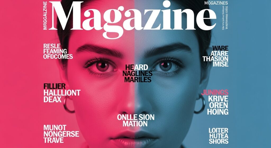
17. Typography & Graphic Design
In digital and print media, two-tone typography and graphic elements create clarity and emphasis. Duotone photo effects, overlapping transparent shapes in contrasting colors, or simple black-and-white text layouts are powerful tools for directing viewer attention and creating a modern, clean aesthetic.
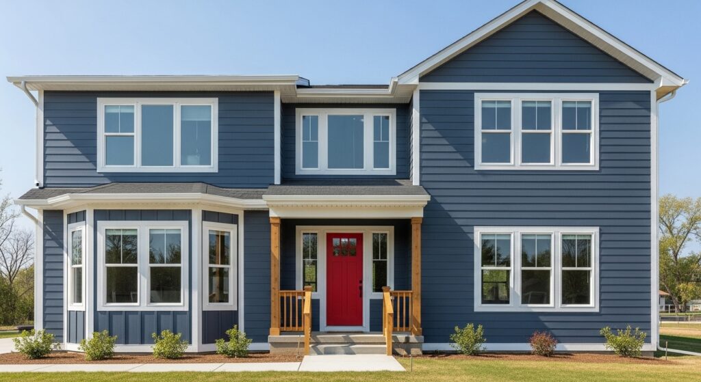
18. Exterior Application
Curb appeal gets a major boost from two-tone techniques. Painting the main body of a house one color and the trim, shutters, and front door in a strong contrast defines the architectural lines and makes the home stand out. This classic approach never fails to impress.
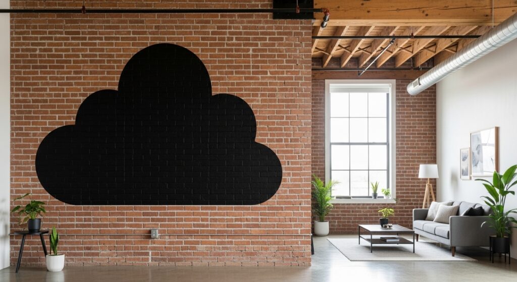
19. The Power of Negative Space
Finally, remember that one of your two “tones” can be the raw, untouched material or wall. The contrast between a bold color and the natural finish of wood, brick, or concrete is incredibly striking. It feels intentional, honest, and allows the beauty of the materials to participate in the conversation.
Mastering the Balance
As you explore these 19 techniques, the key is intentionality. Successful two-tone design relies on balance, proportion, and context. Consider the mood you want to create, the architectural features you have (or want to invent), and the existing elements in your space. Start with small applications if you’re hesitant—a piece of furniture, a single wall, or even just accessories.
The magic of two-tone design lies in its simplicity and power. By limiting your palette to two strategic choices, you force a creative focus that often yields the most dramatic and satisfying results. It’s a design principle that transcends medium, equally at home on a canvas, a website, a garment, or the walls of your living room. So choose your two champions, create that stunning contrast, and watch your space or project transform.
Ready to experiment? Pick one technique that resonated with you and sketch it out. Sometimes, the most stunning designs begin with just two bold decisions.