20 Metallic Color Formulas That Shine Like Jewelry
There’s something undeniably captivating about the luster of metal and the sparkle of gemstones. That radiant, reflective quality instantly conveys luxury, value, and artistry. But what if you could capture that same jewel-like brilliance in your designs, whether you’re painting a mural, styling a room, or crafting a digital masterpiece? You can. The secret lies in the precise blend of hue, saturation, and the subtle suggestion of light.
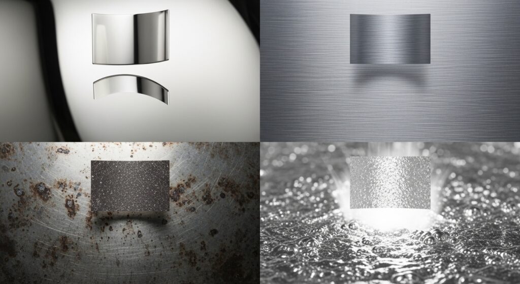
The Alchemy of Metallic Colors: More Than Just Shiny
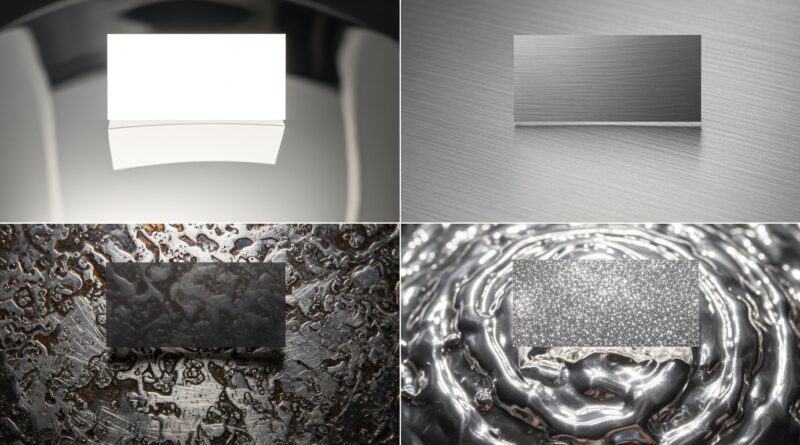
Before we dive into the formulas, it’s crucial to understand what makes a color feel metallic. Unlike flat matte colors, metallics have a dynamic quality. They imply a surface that reflects and absorbs light. This is achieved through a combination of a mid-tone base color, a darker shadow tone within the same hue family, and a highlight of near-white. In digital design, we simulate this with gradients or careful color selection. In physical paint, metallic flakes or pearlescent pigments do the work, but the underlying color choice dictates if it reads as rich brass or cheap foil.
The Gold Spectrum: From Gilded to Antique
Gold is not a single color. Its warmth and character vary dramatically, offering a palette of luxurious possibilities.
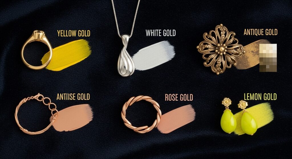
1. Classic Bullion Gold: This is the quintessential, rich 24-karat gold. Formula: Start with a vibrant yellow-orange base. Add a tiny touch of scarlet red to warm it and a minuscule amount of black or raw umber to deepen it, avoiding muddiness. Digital HEX: #D4AF37 / RGB: 212, 175, 55
2. White Gold Alloy: Cool, elegant, and modern. Mix a pale, warm gray with the faintest hint of buttery yellow and a cool blue undertone. It should read as metallic, not simply gray. Digital HEX: #EEE8DC / RGB: 238, 232, 220
3. Antique Gold Patina: Evokes heirloom treasures. Take a deep olive green or mustard base and lightly dust or glaze it over a darker bronze, allowing the underlying darkness to peek through at the edges. Digital HEX: #B09D59 / RGB: 176, 157, 89
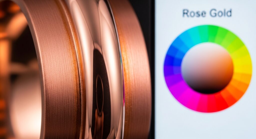
4. Rose Gold Blush: The darling of modern jewelry. A soft copper-pink is key. Mix a copper tone with a rosy pink (think salmon) and soften with a little white. Digital HEX: #B76E79 / RGB: 183, 110, 121
5. Burnished Lemon Gold: A brighter, more cheerful gold. Use a lemon yellow base and add a small amount of bright orange and white for a lighter, shinier effect. Digital HEX: #F0D87A / RGB: 240, 216, 122
The Silver & Platinum Collection: Cool & Cutting-Edge
Silver tones bring a sleek, futuristic, or classic sterling elegance. The complexity here is in the undertones.
6. Polished Sterling Silver: True sterling has a very slight warm, almost imperceptibly creamy undertone to distinguish it from cold steel. Mix a bright silver with a dot of burnt umber. Digital HEX: #D1D1D1 / RGB: 209, 209, 209
7. Chromium Steel: Ultra-cool and blue-based. This is a neutral gray with a strong blue or cyan tint. It should look almost reflective on its own. Digital HEX: #A1B0C4 / RGB: 161, 176, 196
8. Aged Silver (Oxidized): Captures the beautiful blackened crevices of antique silver. Use a dark charcoal gray as a base, and then dry-brush a brighter, pure silver on the high points. Digital HEX Base: #5A5A5A / Highlight: #E3E3E3
9. Liquid Mercury: A mysterious, slightly tinted silver with a hint of vibrant color. Start with a silver base and add a tiny glaze of phthalo blue or violet. Digital HEX: #C2C4C6 / RGB: 194, 196, 198
10. Platinum Dawn: The most prestigious of the white metals. Slightly warmer and denser than white gold. A very light gray with equal, subtle hints of ochre and blue. Digital HEX: #E5E4E2 / RGB: 229, 228, 226
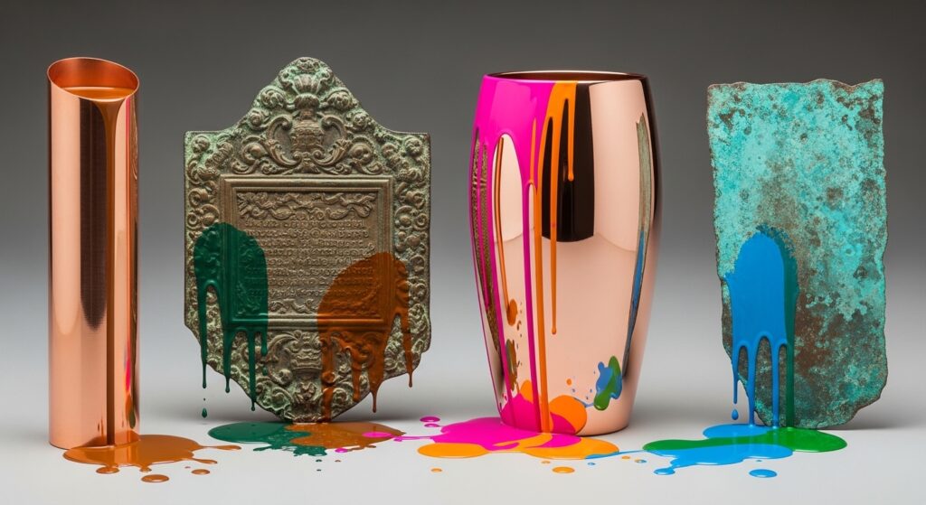
Copper & Bronze: Earthy Warmth
These metals bring organic, rustic, and warmly inviting energy to any palette.
11. New Penny Copper: Vibrant and orange-red. Mix a bright orange with a significant amount of scarlet red and a touch of white to soften. Digital HEX: #B6634C / RGB: 182, 99, 76
12. Statuary Bronze: The deep, green-tinged brown of ancient statues. A rich, dark brown base (burnt umber) with a green oxide glaze over the top is classic. Digital HEX: #8C7853 / RGB: 140, 120, 83
13. Polished Rose Copper: A softer, pinker version of copper. More pink than orange, achieved by mixing copper with rose gold and a bit of silver for shine. Digital HEX: #CB6D5C / RGB: 203, 109, 92
14. Verdigris (Weathered Copper): The stunning blue-green patina. Layer a turquoise or teal over a darker copper base, focusing on recessed areas. Digital HEX: #43B3AE / RGB: 67, 179, 174
15. Dark Gunmetal: A deep, almost black brown with a subtle copper undertone. It reads as a very dark, warm metal. Start with black and mix in equal small parts of burnt sienna and phthalo blue. Digital HEX: #2C3539 / RGB: 44, 53, 57
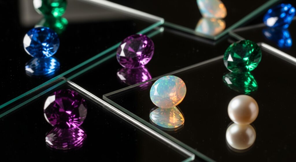
Gemstone Inspired Metallics: The Jewel Tones
Some metals shimmer with the colored reflections of precious stones. These are show-stoppers.
16. Sapphire Steel: A deep blue metal that reflects like a dark sapphire. A navy blue base with a high-gloss finish and a violet-blue highlight. Digital HEX: #2A4B7C / RGB: 42, 75, 124
17. Amethyst Alloy: A regal purple metallic. Mix a deep purple with a small amount of metallic silver pigment or medium. The highlight should be a lavender-gray. Digital HEX: #9D7EAD / RGB: 157, 126, 173
18. Emerald Beryl: Think of polished green gold or a deep emerald ring. A rich green (phthalocyanine) with a touch of gold/yellow to warm it. Avoid making it lime. Digital HEX: #7B9C6C / RGB: 123, 156, 108
19. Black Opal: The ultimate iridescent color-shifter. While impossible to replicate perfectly, create a very dark base (black or deep purple) and overlay with translucent glazes of peacock blue, magenta, and gold at different angles. Digital HEX Base: #0A0A0A / Glaze: #33CCCC (cyan)
20. Pearl Essence: Not a pure metal, but the ultimate iridescent sheen. A soft off-white (ivory) with a subtle pink, blue, or gold duochrome effect. It’s all in the shifting highlight. Digital HEX: #F8F4E6 / RGB: 248, 244, 230
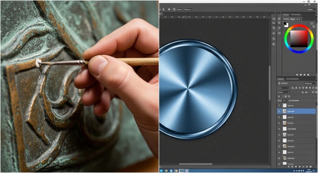
How to Apply Your Metallic Color Formulas
Knowing the formula is half the battle. Applying it effectively is what makes the magic happen.
For Physical Paints: Use a quality metallic or pearlescent medium to mix with your base colors. Always apply over a smooth, primed surface. For depth, use techniques like dry brushing to apply the highlight color or glazing to add a tinted shadow. Lighting is crucial—position lights to catch the reflective flakes.
For Digital Design: Flat color won’t look metallic. You must create a gradient or use layer styles. A simple method is a linear gradient from your shadow color (dark) to your base color (mid) to your highlight (light). Add a subtle noise texture or a low-opacity pattern to simulate grain. Consider using overlay or soft light layers for additional sheen.
In Interior Design: Use these colors as accents. A wall in “Statuary Bronze” would be overwhelming, but an accent wall, a piece of furniture, or decorative molding in that hue becomes a stunning focal point. Pair cool metallics like “Chromium Steel” with other cool tones (blues, grays), and warm metallics like “Rose Gold” with warm neutrals (creams, taupes).
Final Thoughts: Let Your Projects Gleam
Metallic colors are a powerful tool in any creator’s kit. They add dimension, evoke emotion, and create a sense of crafted quality. By moving beyond the basics and exploring the nuanced world of jewelry-inspired tones—from the warm embrace of Antique Gold Patina to the futuristic chill of Chromium Steel and the mystical shift of Black Opal—you elevate your work from the ordinary to the extraordinary.
Start by choosing one or two formulas that resonate with your current project. Experiment with application, play with light, and don’t be afraid to layer. Remember, the goal is not just to be shiny, but to possess the depth, character, and luminous quality of a finely crafted piece of jewelry. Now go forth and make things that shine.