
16 Sombre Techniques for Subtle, Sophisticated Color
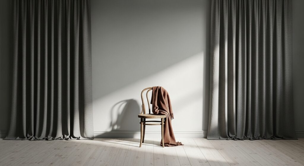
In a world saturated with vibrant, shrieking hues vying for our attention, there exists a quieter, more powerful form of visual expression: the sombre palette. Sombre—meaning dark, dull, or muted—is often misunderstood. It is not merely about sadness or gloom, but rather a profound sophistication found in restraint. It is the whisper that silences the shout, the shadow that gives form to light, the complex, dusty, tonal color that speaks of heritage, nuance, and timeless elegance.
1. The Foundation: Mastering Tone Over Hue
The first step towards sombre sophistication is to shift your focus from hue (the color itself) to tone. Tone refers to the lightness or darkness of a color, achieved by adding grey. By prioritizing tonal harmony, you can create compositions where colors relate seamlessly, even if their hues are different. A deep slate, a mid-tone taupe, and a pale ochre can exist in perfect harmony because they share a similar tonal value, creating a cohesive and calming effect.
2. Embrace the Complexity of “Dirty” Colors
Sombre colors are rarely pure. They are “dirtied” or broken with complements, black, or grey. Add a touch of its complementary color (e.g., a hint of red to a green) to ground it and remove artificial brightness. This creates colors that feel natural, organic, and inherently sophisticated, as if pulled from a landscape or a weathered fresco.
3. The Power of the Monochromatic Study
Limit your palette to variations of a single, muted hue. Explore its full tonal range from the deepest shade to the palest tint. This technique forces a deep understanding of light, shadow, and form, resulting in a space or design that feels intentionally curated, serene, and deeply unified. Think of a room in shades of only smoky blue, from the near-black navy of an armchair to the pale, cloud-like hue of the ceiling.

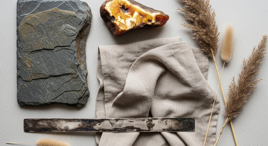
4. Utilize Natural, Unadulterated Materials
Nature is the ultimate master of sombre color. Incorporate materials in their raw, unfinished states: unbleached linen, raw silk, weathered wood, oxidized brass, unglazed terracotta, and natural stone. These materials bring their own inherent, muted color stories and exquisite textures, adding authenticity and depth that synthetic, brightly colored materials cannot replicate.
5. Find Sophistication in Shadow and Patina
Seek out colors that mimic the effects of time and wear. Instead of a bright cherry red, choose a oxidized burgundy that resembles aged wine. Favor the greenish-blue of weathered copper over a bright teal. These colors tell a story. They evoke a sense of history, resilience, and layered beauty, immediately adding soul and maturity to your palette.

6. Subdue with Neutrals as Active Participants
In a sombre scheme, neutrals are not passive backgrounds. Charcoal, putty, stone, and oat are active, vibrant elements. Use a warm grey to soften a cool muted lavender, or a deep brown-black to ground a series of pale, chalky pastels. The interplay between different types of neutrals (warm vs. cool, dark vs. light) creates immense visual interest without a single saturated hue.
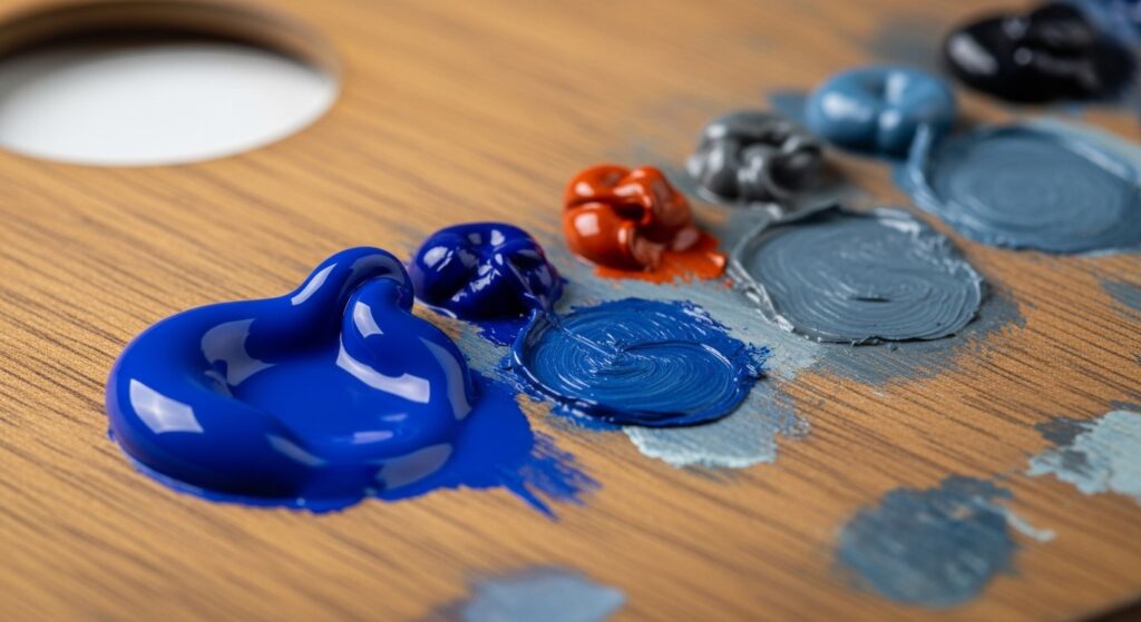
7. Control Saturation Like a Conductor
Think of saturation (the intensity of a color) as volume. In a sombre composition, all colors are playing at a lower, more nuanced volume. Intentionally desaturate your palette. If using digital tools, lower the saturation slider. When mixing paint, consistently add a neutralizer. This creates a uniform level of quiet intensity across the board.

8. Layer Translucent, Muted Glazes
This technique, borrowed from classical painting, involves applying thin, transparent layers of color over one another. Each translucent glaze modifies the layer beneath, creating a depth and luminosity that flat, opaque color cannot achieve. A glaze of muted yellow over a grey base can create a luminous, complex olive that seems to glow from within.
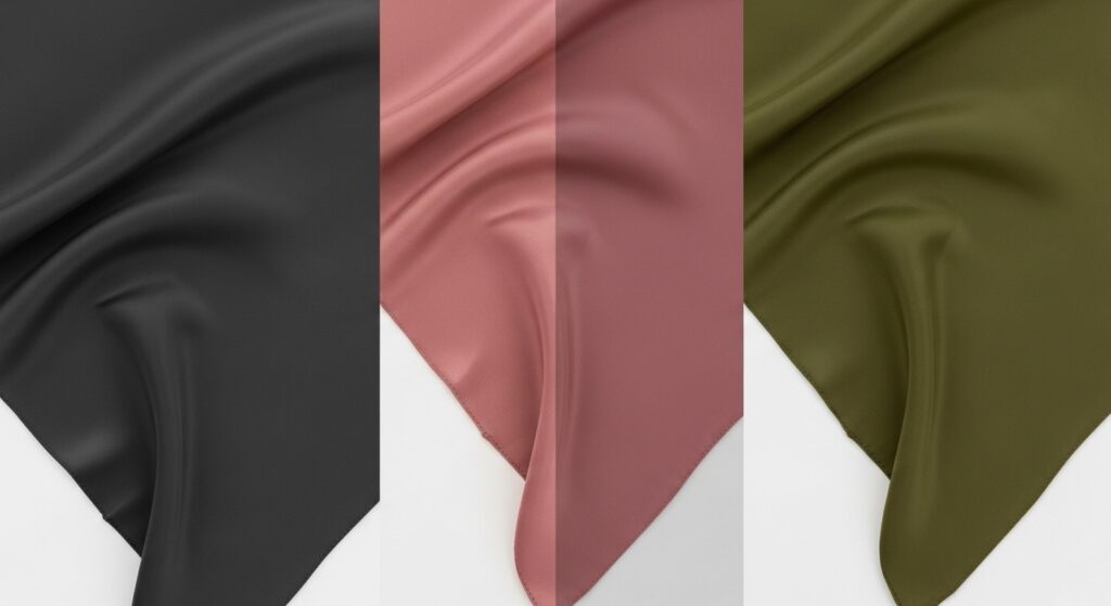
9. Employ the “Dusty” Pastel Strategy
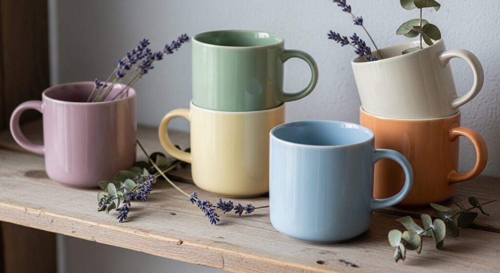
Pastels need not be sugary. To create a “dusty” pastel, take a standard pastel and mix it with a significant amount of grey or a touch of its complement. The result is a color like ashes of roses, pale eucalyptus, or dusty lilac—soft and light, yet grounded and sophisticated, devoid of childishness.
10. Anchor with Deep, Not Black, Darks
Avoid using pure black as your anchor, as it can flatten a sombre scheme. Instead, choose ultra-deep versions of your muted hues: a very dark forest green, a midnight blue with grey undertones, a rich chocolate brown, or a charcoal with a hint of plum. These deep tones provide contrast and structure while remaining within the tonal, complex color family.
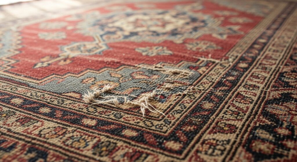
11. Source Inspiration from Faded Heritage
Look to historical sources where time has done the muting: faded tapestries, peeling paint on old doors, sun-bleached vintage posters, the interiors of ancient libraries, or the colors of the Italian Renaissance after centuries of gentle decay. These palettes are pre-approved by history and carry an instant aura of gravitas.
12. Prioritize Texture as a Color Element
When color is restrained, texture sings. A sombre palette relies on the play of light across different surfaces to create visual drama. Combine nubby wool, smooth marble, brushed metal, rough plaster, and soft velvet—all within a tight tonal range. The texture will make a single color appear to shift and change throughout the day.
13. Implement Strategic, Minimal Pops
Sombre does not mean devoid of contrast. The key is a strategic, minimal pop of a slightly more saturated or brighter tone—but still within the muted spectrum. A single cushion in a muted rust against a sofa of pale grey-green, or a vase in a slightly brighter (but still chalky) cobalt blue on a shelf of taupe and beige. The pop is relative, not absolute.
14. Understand the Role of Undertones
Sombre colors are defined by their subtle undertones. A grey can be warm (with pink/brown) or cool (with blue/green). A beige can be pinkish, yellowish, or greenish. For harmony, ensure the undertones in your palette relate to one another. Mixing a warm-undertoned grey with a cool-undertoned beige can create visual discord, disrupting the serene feeling.
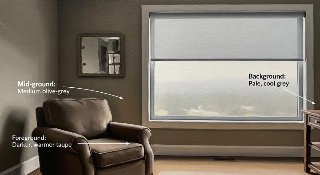
15. Create Atmospheric Perspective with Color
Use the principles of atmospheric perspective—where distant objects appear lighter, cooler, and less saturated due to particles in the air—in your compositions. In an interior, use slightly darker, warmer tones in the foreground and lighter, cooler tones in the background to create a sense of depth and airiness within a muted scheme.
16. Edit Ruthlessly for Cohesion
The final and most critical technique is ruthless editing. A sombre palette is an exercise in discipline. Constantly assess each element. Does this color, despite being beautiful on its own, stick out because it is too pure or bright in this context? Have the courage to remove it. Cohesion is the ultimate goal, where every element feels essential and inherently part of the whole.
Conclusion: The Quiet Confidence of Sombre Hues
Mastering sombre color is not about limitation, but about liberation into a world of subtlety, nuance, and profound sophistication. It is a visual language that values atmosphere over announcement, feeling over flash, and timelessness over trends. By employing these 16 techniques—from tonal thinking and embracing complexity to strategic texturing and ruthless editing—you cultivate an eye for the exquisite detail, the whispered suggestion, the color that endures.
In a noisy visual culture, the choice to be quiet, considered, and sombre is a powerful statement. It invites closer looking, creates spaces for reflection, and ultimately, builds a visual identity of deep, resonant elegance. Begin by muting one color, studying a shadow, or embracing a material in its raw state. You may find that in the subtlety, a whole new world of color reveals itself.