Disconnected Ends: Separated Tips for Texture
Close your eyes and run your fingers across a rough brick wall, a smooth pebble, the frayed edge of a well-loved book. Texture is the silent language of touch, a dimension we experience physically long before we understand it visually. But in the flat, pixel-perfect worlds we so often design and inhabit, how do we translate that rich, tactile sensation? The answer lies in a seemingly counterintuitive principle: disconnection.

The Psychology of the Gap: Why Broken Lines Feel More Real
Our brains are incredible pattern-completion machines. When presented with a series of dashes, we see a line. When shown a collection of distinct dots, we connect them into a shape. This cognitive process is exactly what makes the technique of disconnection so potent. By providing visual clues—separated tips, overlapping but not touching shapes, clusters of isolated marks—we invite the viewer to participate in the creation of the texture.
This engagement creates a deeper, more memorable experience. A solid, unbroken block of color says “flat.” A series of staggered, disconnected rectangles in similar hues whispers “wooden planks,” “woven fabric,” or “scaly surface.” The gap itself becomes active. It holds shadow, implies a drop, suggests wear and tear, or reveals a layer beneath. This perceived depth is the cornerstone of texture. It moves a surface from being merely seen to being felt vicariously.
Tools of Separation: Practical Techniques Across Mediums
Understanding the theory is one thing; applying it is another. Let’s explore concrete ways to harness the power of disconnected ends in various creative fields.
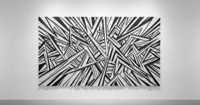
In Drawing and Illustration: Move beyond continuous contour lines. Try sketching with short, swift, non-connecting strokes to build up form. This is the essence of hatching and cross-hatching, where the accumulation of separated lines creates value and texture simultaneously. For organic textures like fur, grass, or hair, draw clusters of lines that vary in length and direction, ensuring their ends are distinct and do not neatly meet. This chaos mimics nature’s imperfect order.
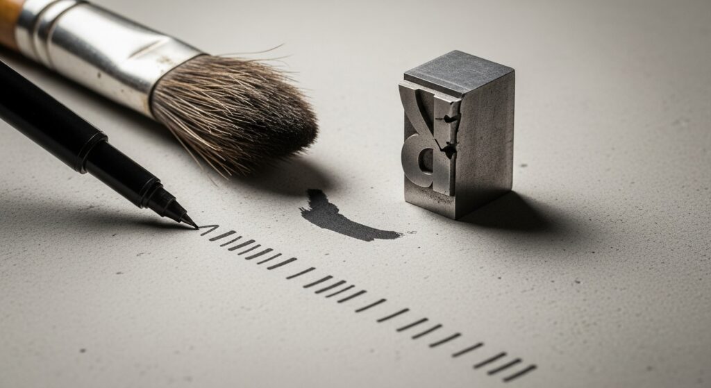
In Graphic Design and Typography: Custom lettering or logo design can gain immense character from disconnected ends. Instead of a perfect join at the corner of a letterform, allow the stroke to fall short or extend slightly. Use textured brushes in your design software that naturally create broken edges. For backgrounds, consider patterns built from non-touching elements—scattered dots, dashed grids, or offset shapes—to create a subtle, sophisticated tactile backdrop.
In Photography and Styling: Texture here is about composition and arrangement. Photograph a stack of disheveled papers instead of a neat pile. Style a fabric so its fringe is visibly separated and catching the light. Focus on subjects where erosion, decay, or growth has created natural separation: cracked earth, a peeling paint, a burst seed pod. The story is in the separation.
Digital vs. Analog: Embracing Imperfection in a Perfect World
The digital realm, with its vectors and perfect Bézier curves, is where the principle of disconnection becomes most revolutionary. Digital art can risk feeling cold because it lacks the inherent “noise” of analog mediums. Intentionally introducing disconnected ends is a primary method to inject warmth.
This can mean using brush packs that simulate dry media, where the stroke fades and breaks up. It can involve using a scatter brush to place elements that never quite touch. In UI/UX design, subtle textured backgrounds created with noise or micro-patterns of separated dots can make an interface feel more grounded and less stark. The goal is to simulate the happy accidents of the physical world—the way ink bleeds unevenly, charcoal crumbles, or a brush splays.
Conversely, in analog work, you can amplify this natural disconnection. Let the grain of the wood guide your paint, causing it to skip. Use a fraying piece of rope as a stamp. Allow collage elements to have rough, torn edges that don’t align perfectly. In both cases, you are celebrating the gap, the break, the space between as an active element of the composition.

Balance and Intent: Avoiding the Chaotic Pitfall
Like any powerful tool, disconnection must be used with intent. The objective is not to create a random, confusing mess but to guide the viewer’s sensory imagination. The key is balance and rhythm.
A texture made entirely of disconnected, scattered elements can feel noisy and unsettling if there’s no underlying structure. Anchor your separated elements with areas of solidity or calm. Use repetition in the size or direction of your gaps to create a rhythm. For instance, a series of parallel dashed lines feels orderly, while the same dashes scattered randomly feels chaotic. The separation should feel purposeful, a suggestion of how light falls, how material wears, or how growth occurs.
Ask yourself: What is this gap representing? Is it a shadow? A space between threads? A chip in stone? When the disconnection serves the narrative of the material, it will feel authentic and compelling.

From Visual to Emotional: The Texture of Feeling
Ultimately, texture is not just a visual trick; it’s an emotional cue. The textures we create through disconnection carry subconscious weight. Sharp, jagged, disconnected shards can evoke tension, danger, or raw energy. Soft, feathered, separated ends suggest gentleness, fragility, or natural decay. Smooth, rounded, but distinct dots can feel modern, digital, or bubbly with joy.
By mastering the tips of separation, you gain control over this emotional subtext. A website for a rugged outdoor brand will benefit from textures built from sharp, broken, overlapping elements. A brand for a luxury spa might use textures of softly disconnected, translucent layers that evoke mist and silk. You are, in essence, designing a feeling, using the most primal of our senses—touch—as your guide, even when the medium is purely visual.

Begin Your Experiment: A Starter Challenge
Ready to put disconnected ends into practice? Here’s a simple exercise to get started. Choose one object: a leaf, a piece of fabric, a stone. First, draw or design it using only solid, connected shapes and lines. Notice how it feels. Now, recreate the same object using only disconnected elements—dashes, dots, separate shapes that overlap but don’t touch. Force yourself to suggest the edges, the veins, the wear, and the shine through separation and gap.
You will likely find the second version is richer, more dynamic, and feels more “real.” It has a texture you can almost grasp. This is the magic of the disconnected end. It’s a reminder that in art and design, as in life, what is left out is just as important as what is put in. The spaces between tell the story. So, go ahead—break the line, separate the tip, and let the texture breathe.
Start looking at the world through the lens of separation. Notice the cracked pavement, the individual bristles on a brush, the separate tiles in a mosaic. See not just the objects, but the active, textured gaps that define them. Then, bring that vision into your own creative work. Master the ends, and you will master the feel.