Graduated Perimeter: Building Edge Texture
In the world of design, whether architectural, digital, or graphic, the edges are where the action happens. They are the transition zones, the boundaries that define form and create first impressions. Yet, too often, edges are treated as mere afterthoughts—sharp, uniform lines that simply contain an object. But what if we could transform these boundaries into rich, engaging experiences in their own right? Enter the concept of the Graduated Perimeter. This sophisticated technique moves beyond the hard line to build texture, depth, and narrative into the very edges of a structure or design. It’s a philosophy that understands a perimeter not as a wall, but as a gradient of engagement.
What is a Graduated Perimeter?
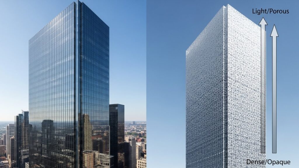
At its core, a Graduated Perimeter is a design principle where the boundary or edge of an object, space, or interface is deliberately varied in density, transparency, complexity, or materiality. Instead of a consistent, unbroken line, the perimeter graduates or transitions from one state to another. Imagine a building that is solid and grounded at its base but becomes increasingly porous and fragmented as it rises, blending with the sky. Or a website header that transitions from a solid color into a delicate, wispy pattern at its lower edge. This graduation creates a textured edge that invites the eye to linger and explore.
The power of this technique lies in its ability to manage visual weight and connection. A heavy, solid perimeter feels imposing and separate. A light, porous one feels open and connected. A Graduated Perimeter allows a design to be both—to have a grounded presence while also achieving lightness and integration with its surroundings. It’s about controlled dissolution, a masterful balance between definition and diffusion.
The Architectural Roots: From Brutalism to Biophilia
Architecture provides the most visceral examples of the Graduated Perimeter in action. Historically, many structures presented a uniform facade from ground to roof. However, modernist and contemporary architects began manipulating the building envelope to respond to context, function, and human experience.
Consider the classic columnar base-shaft-capital system of classical architecture—a primitive form of graduation. Fast forward to the work of architects like Alvar Aalto or Jean Nouvel, who masterfully dissolve edges. Aalto’s buildings often use brick or tile that becomes more irregular or spaced out at the edges, softening the structure’s relationship to the landscape. Nouvel’s Institut du Monde Arabe in Paris features a breathtaking southern facade with mechanical iris-like apertures that graduate in density, controlling light and creating a mesmerizing textured edge.
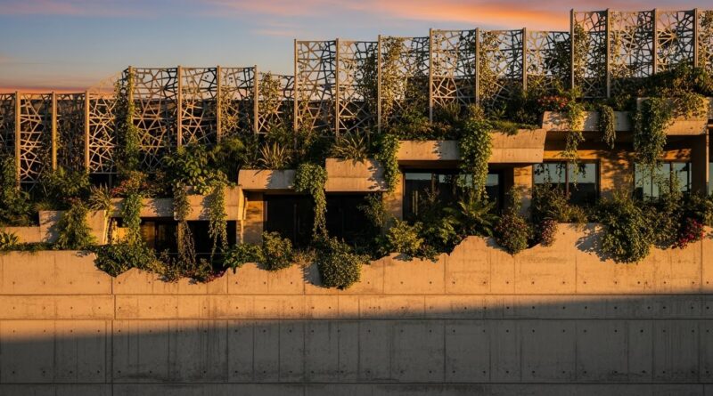
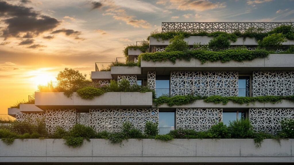
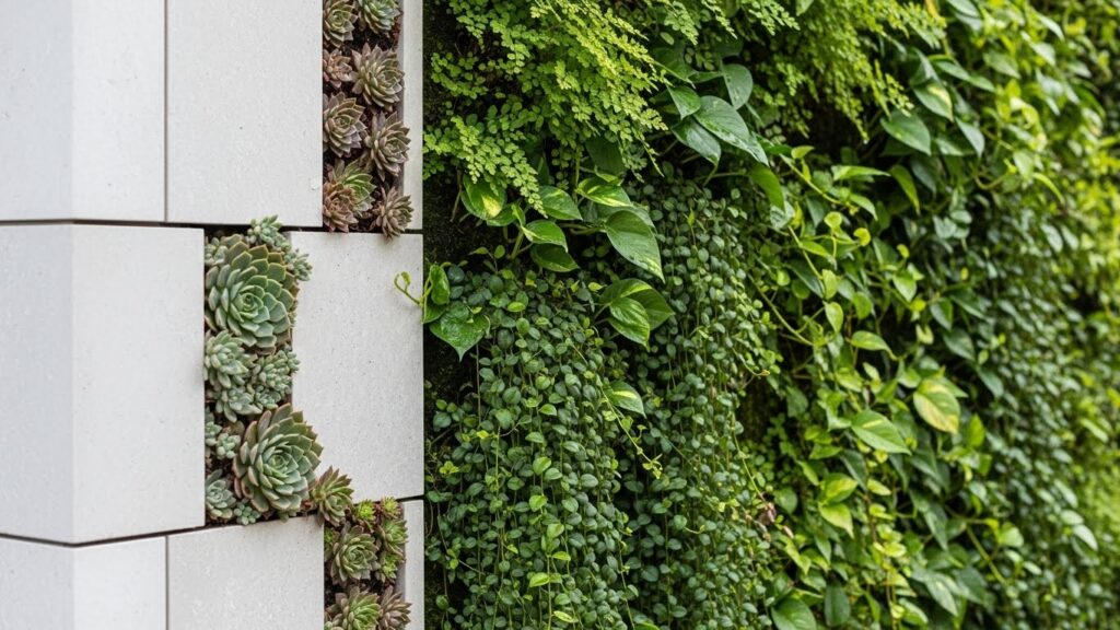
Today, with the rise of biophilic design, the Graduated Perimeter is a key tool. Building edges are transformed into vertical ecosystems. A concrete wall graduates into a planter system, which graduates further into a green facade, and finally into a rooftop garden. The hard architectural line literally blossoms into a living, breathing texture, blurring the boundary between the built and natural environment.
Applying Edge Texture to Digital and Graphic Design
The principle translates seamlessly from the physical to the digital realm. In user interface (UI) and web design, every container—every button, card, modal, or header—has a perimeter. A flat, uniform border creates a stark, often sterile container. Applying a graduated perimeter concept can add sophistication and guide user attention.
For instance, a website’s hero section might use a background gradient that’s dark and solid at the top (for legibility of the logo and nav) but gently fades to transparent or a lighter texture at the bottom, creating a soft “edge” that invites the user to scroll. A card component might have a subtle shadow that is densest at the bottom edge and dissipates upward, giving a lifted, textured feel without a harsh line. Micro-interactions can also use graduation: a button’s hover state might see its border transition from a solid line to a dotted or animated gradient line, creating texture through time and interaction.
In graphic design and branding, this can manifest in logo marks that play with incomplete outlines, or in print materials where the edge of a poster bleeds from image into a grainy texture or typographic pattern. It’s about treating the frame as part of the artwork, not just its limit.

The Psychological Impact: Why Textured Edges Engage Us
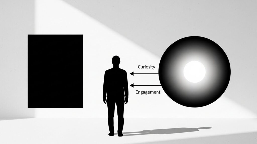
Why does a Graduated Perimeter feel more engaging than a hard line? The answer lies in human perception and psychology. Our brains are wired to seek patterns and, crucially, to interpret transitions. A hard, sudden edge signals a full stop—a definitive boundary. In contrast, a graduated edge signals a process, a transition, or a connection.
This textured edge creates visual interest and hierarchy. It tells a story of transformation, from solid to air, from private to public, from defined to open. It fosters a sense of curiosity and exploration. In an urban setting, a building with a graduated, porous edge at street level feels more inviting and less monolithic. On a screen, a softly fading edge suggests there is more content to discover, encouraging continued engagement (like the ever-important scroll). It reduces visual fatigue by avoiding harsh contrasts and creates a more organic, less mechanically rigid experience that feels intuitively more natural to us.
Practical Techniques for Implementing Graduated Perimeters
How can you start building edge texture into your own projects? Here are actionable approaches across different mediums:
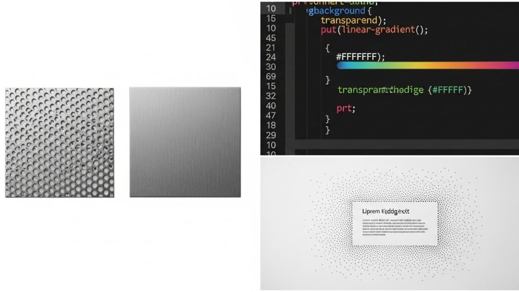
In Physical Spaces/Architecture: Use material transitions. Combine stone with metal mesh, solid wood with laser-cut panels, or concrete with integrated planting. Employ layered facades where an outer skin becomes progressively more perforated or spaced. Think in sections: a solid base, a middle layer with medium porosity (for windows and balconies), and a highly porous or sculptural top.
In Digital Design (CSS/UI): Master the use of CSS gradients (`linear-gradient`, `radial-gradient`) to create fading edges on backgrounds. Utilize `box-shadow` with spread and blur values to create soft, graduated shadows that texture an element’s perimeter. Experiment with `border-image` with gradient values for non-uniform borders. Use masking or SVG shapes to create custom, textured edge shapes for sections.
In Graphic Design: Play with brush strokes, texture overlays, or grain filters that are denser at the edges and fade inward. Use typography or pattern to create a “fringe” along the border of a layout. In illustration, vary line weight or use stippling/dots that graduate in density to define a form’s edge rather than a continuous line.
Conclusion: Redefining Boundaries as Conversations
The Graduated Perimeter is more than a stylistic choice; it is a design philosophy that reimagines the purpose of an edge. It challenges the notion of a boundary as a separator, proposing instead that it be a mediator, a transition zone, and a source of texture and story. By building texture into our perimeters—whether in the concrete of a building, the pixels of a website, or the layout of a brochure—we create work that is more dynamic, more human-centric, and more deeply integrated with its context.
In a world that can often feel sharply divided, the idea of a graduated, textured edge offers a powerful metaphor for connection. It reminds us that the most interesting and engaging spaces, both physical and digital, are often those where the boundaries are not walls, but conversations. Start looking at the edges in your environment and your designs. Ask yourself: Could this perimeter tell a richer story? The answer will lead you to more compelling, textured, and graceful design.