Graduated Texture: Building Movement from Top to Bottom
In the world of visual design, we are constantly seeking tools to create rhythm, direct attention, and evoke emotion. Color, shape, and typography are the usual suspects. But there is a subtler, profoundly powerful technique that often operates in the background: graduated texture. This is the art of creating a progression—a deliberate shift in visual or tactile density, scale, or pattern that guides the viewer’s journey from one point to another. When applied from top to bottom, it becomes a masterful tool for building movement, implying narrative, and grounding a composition in a way that feels both dynamic and intrinsically ordered.
The Psychology of Visual Flow: Why Direction Matters
Human perception is inherently directional. We read from top to bottom (in Western cultures), we understand gravity’s pull, and we associate “beginning” with “top” and “conclusion” with “bottom.” A graduated texture leverages this ingrained psychology. By placing the most complex, dense, or “heavy” textural elements at the top, you create a visual anchor—a point of entry. The subsequent graduation downward provides a path for the eye to follow, like a gentle stream flowing from a source.
This creates a sense of natural movement and resolution. The viewer doesn’t scan randomly; they are led on a curated journey. A top-heavy texture gradient can feel grounding and stable, echoing the way landscapes often have detailed foliage or structures at eye level that give way to simpler, smoother grounds or skies. Disrupting this flow—placing density at the bottom—can create tension, intrigue, or a sense of uplift, but it requires careful handling. The core principle remains: texture graduation is a silent guide, using direction to manage pace and focus within any spatial composition.
Crafting the Gradient: Methods for Textural Progression
Implementing graduated texture isn’t limited to fading a single pattern. It’s about creating a perceptible shift in visual weight. Here are key methods to build this progression:
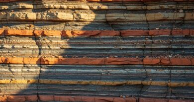
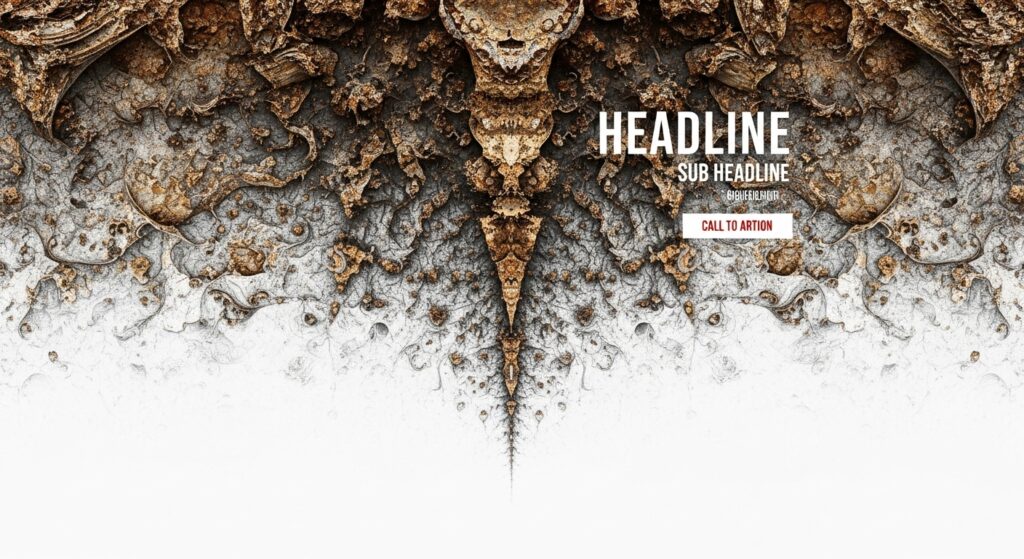
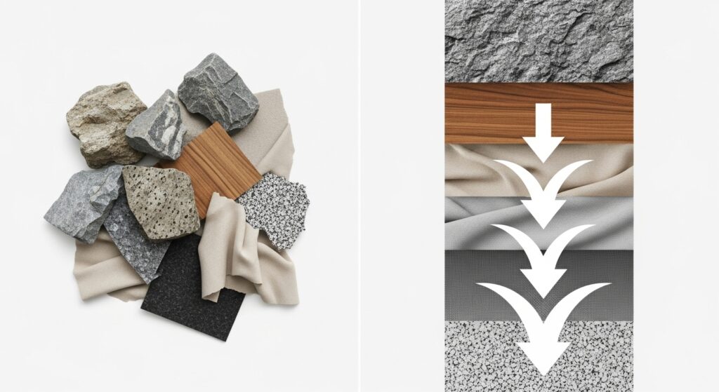
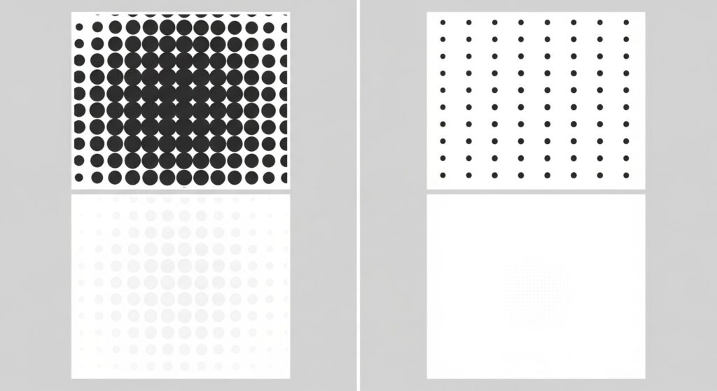
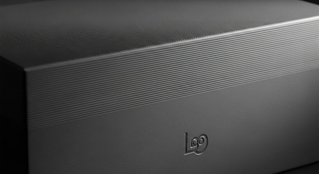
Density and Scale: This is the most direct approach. Start with tightly packed, larger-scale textural elements at the top. As you move down, gradually increase the spacing between elements and reduce their scale. Think of a forest canopy (dense, detailed) transitioning to a meadow (open, sparse).
Opacity and Layering: Overlay textures and play with their transparency. A top layer with strong opacity (like a gritty grain or geometric line pattern) can gradually fade to 0%, revealing a clean base beneath. This creates a beautiful dissolving effect that feels both intentional and ethereal.
Pattern Evolution: Begin with a complex, intricate pattern (like a detailed geometric or organic motif) and gradually simplify its form. The pattern might break apart, become more rhythmic, or morph into a mere suggestion of its original form at the bottom. This tells a story of deconstruction or calming order.
Material Suggestion: In UI and product design, use visual cues to imply texture. A “frosted glass” or “woven fabric” effect at the top of a digital interface can subtly shift to a “smooth ceramic” or “matte paint” feel at the bottom, using subtle shifts in shadow, noise, and highlight.
Digital Applications: UI/UX and Web Design
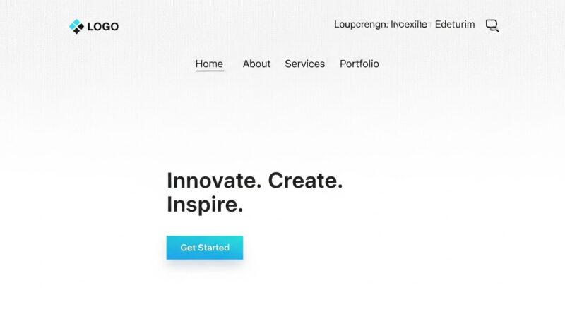
In digital spaces, graduated texture is a secret weapon for enhancing usability and aesthetic appeal. A website header with a subtle, dense noise texture or a fine line pattern can lend authority and tactile interest, distinguishing it from the content area. As the user scrolls, this texture can fade, allowing the core content (text, images) to sit in a less competitive, more readable space.
This technique is exceptionally effective for creating depth and separating sections without harsh dividers. A background with a gentle vertical texture gradient can make foreground elements like cards or buttons feel more “layered” and tangible. Furthermore, in long-scrolling pages, a gradual textural change from top to bottom can subconsciously signal progression through content, reducing visual fatigue and marking a journey’s end at the footer. It’s a non-intrusive way to say, “You’ve arrived.”
Physical and Print Design: Tactile Storytelling
The power of graduated texture is magnified when it can be physically touched. In print design, this can be achieved through specialty finishes. Consider a book cover that uses spot UV gloss in a dense pattern at the top, which gradually uses less of the coating as you move down, ending in a pure matte finish. The reader’s hand feels the journey from shiny to soft.
Packaging design excels with this approach. A beverage bottle might have a raised, textured label at the top for grip and brand presence, which smoothly integrates into the smooth glass of the body. In architecture and interior design, a feature wall could start with stacked, rough stone at the bottom (grounding it) that graduates to smoother, smaller tiles or even flat paint at the top—visually lifting the space. It’s a method that connects the object to human interaction, guiding the touch as well as the eye.
Avoiding Common Pitfalls: Subtlety is Key
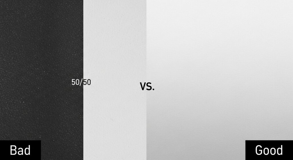
As with any potent technique, the misuse of graduated texture can lead to clutter, confusion, or dated aesthetics. The goal is felt movement, not obvious spectacle. A gradient that is too harsh or abrupt becomes a simple divider, losing its kinetic quality. The texture itself should be chosen with purpose; a noisy, distracting pattern graduated down will still be a distraction.
Always ensure the texture serves the content, not competes with it. In digital contexts, monitor performance—overly complex texture images can slow load times. The most successful implementations are often the ones you feel before you consciously see. Test your designs by squinting your eyes; the sense of flow from dark (dense) to light (sparse) should still be apparent. If it disappears or looks like a blocky stripe, refine the graduation to be more gradual.
Putting It Into Practice: A Simple Framework
Ready to experiment? Follow this basic framework to incorporate top-to-bottom graduated texture into your next project:
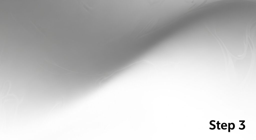
1. Define the Anchor: Decide what element at the top of your design needs emphasis—a logo, a headline, a navigation bar. This will be your textural anchor point.
2. Choose Your Texture: Select a texture that aligns with the brand or emotion (organic, tech, elegant, rugged). Start with a low-contrast, repeatable pattern.
3. Map the Journey: Sketch the desired eye path. Do you want a fast descent or a slow, lingering flow? This determines the gradient’s steepness.
4. Apply and Refine: Use layer masks, opacity gradients, or spacing adjustments to create the progression. Step back frequently to assess the overall movement.
5. Integrate with Content: Place your core content (text, key images) in zones where the texture recedes, ensuring perfect readability and focus.
The Bottom Line on Movement
Graduated texture from top to bottom is more than a stylistic choice; it is a foundational compositional strategy. It brings a static canvas to life by introducing a gentle, guiding rhythm. It leverages our natural perceptual biases to create designs that feel coherent, intentional, and effortlessly engaging. Whether in the pixels of a screen or the material of a product, this technique builds a bridge between the visual and the visceral.
In an age of flat design and minimalism, texture—and particularly graduated texture—offers a path back to depth, warmth, and dynamic storytelling. It reminds us that design is not just about what we see, but how we move through what we see. So, look at your next project from top to bottom. Ask yourself: where can a whisper of progression, a shift in density, or a fade into calm create a more compelling and human experience? The answer might just be the key to unlocking a new dimension of flow.