Greige Highlights: Gray-Beige Blend
In the ever-evolving world of interior design, color trends come and go with the seasons. But every so often, a hue emerges that feels less like a passing fad and more like a fundamental shift—a color so perfectly balanced, so inherently versatile, that it redefines our understanding of neutral. Enter greige. This elegant marriage of gray and beige has quietly ascended from a niche designer secret to a mainstream powerhouse, gracing everything from minimalist lofts to cozy family homes. But what is it about this chameleon-like color that has captivated homeowners and designers alike? This deep dive into the world of greige will explore its undeniable appeal, practical applications, and the secrets to making this sophisticated neutral work for you.
The Genesis of Greige: Why This Hybrid Hue Works
To understand greige’s triumph, we must first look at its parents. Gray, for years, was the cool, modern neutral, often associated with sleekness and a slightly industrial feel. Beige, its warmer counterpart, ruled the roost for decades, offering comfort but sometimes risking a dated or flat appearance. Greige is the diplomatic resolution to this tonal standoff. It borrows the contemporary, grounded sophistication from gray and infuses it with the welcoming, earthy warmth of beige. The result is a color that adapts. In north-facing rooms with cooler light, greige leans into its beige undertones to add warmth. In south-facing rooms awash with warm light, its gray aspects come forward to provide a balancing coolness. This chameleon quality eliminates the guesswork and anxiety often associated with choosing a whole-house neutral.
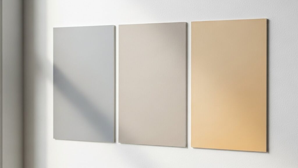
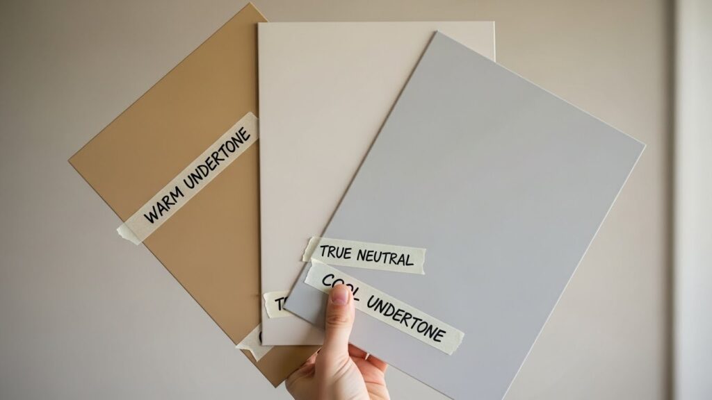
Finding Your Perfect Greige: Undertones Are Everything
Not all greiges are created equal. The magic—and occasional challenge—lies in its undertones. The specific blend of gray and beige can pull warm (with hints of pink, yellow, or purple), cool (with subtle blue or green notes), or sit perfectly neutral. The key to success is testing. Paint large swatches (at least 2’x2′) on multiple walls and observe them at different times of day. How does it look under your morning lamps versus the afternoon sun? A greige that looks perfectly balanced in the store can reveal surprising undertones in your unique lighting. Remember, your fixed elements—like flooring, cabinetry, and countertops—will also interact with the color. A greige with green undertones might complement marble beautifully, while one with violet notes could clash with oak flooring.
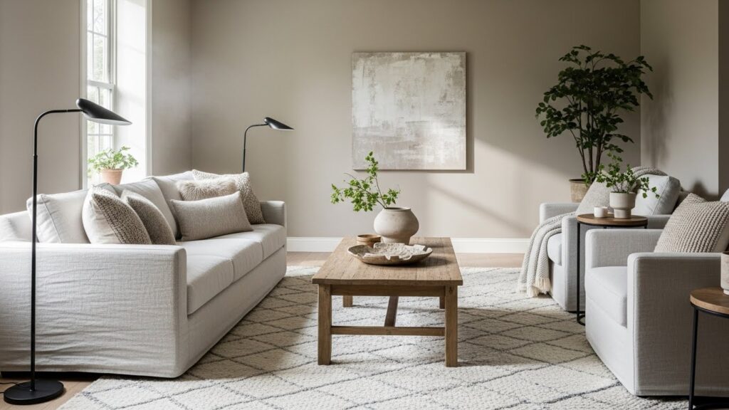
Greige in Action: Room-by-Room Application
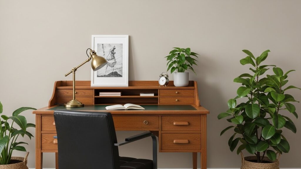
The true strength of greige is its chameleon-like ability to set the right tone in any space. In the living room, it creates an instant atmosphere of relaxed sophistication, a flawless canvas for both bold art and serene minimalism. For bedrooms, greige promotes unparalleled tranquility, its earthy warmth making the space feel like a secure cocoon. In kitchens, it brings a timeless, clean look to cabinetry or walls, pairing effortlessly with both white marble and dark wood countertops. Even in home offices, greige shines by providing a focused, undistracting background that is far more personable than stark white or corporate gray. It’s the ultimate unifying agent in open-plan living, flowing seamlessly from one zone to the next without monotony.
The Perfect Pair: Colors That Love Greige
While stunning on its own, greige truly comes to life when paired with thoughtful accents. Its neutrality makes it compatible with almost any color scheme. For a serene and monochromatic look, layer different textures—think nubby wool throws, smooth leather, and sheer linens—in shades of white, cream, and darker charcoal. To inject energy and modernity, pair greige with bold hits of navy blue, emerald green, or matte black. These deep colors create stunning, dramatic contrast. If you crave warmth and vibrancy, terracotta, mustard yellow, or blush pink accents bring a beautiful, organic feel. And for a timeless, elegant combination, you can never go wrong with greige and crisp, pure white trim and ceilings—a pairing that always looks intentional and fresh.
Beyond Paint: Incorporating Greige in Textiles and Finishes
Greige’s influence extends far beyond wall color. Embracing this trend holistically can create a deeply cohesive and textured space. In upholstery, a greige sofa or armchair is a practical and stylish investment, hiding minor wear while providing a foundational piece. In textiles, curtains, rugs, and pillows in greige tones add layers of comfort without visual clutter. For finishes, consider greige in large-format tiles for bathroom walls, a linen closet door painted in a deeper shade, or even through natural materials like unsealed limestone, travertine, or certain wood stains that inherently express the gray-beige blend. This multi-sensory approach makes the color feel inherent to the space, not merely applied.
A Timeless Choice in a Trend-Driven World
In conclusion, the rise of greige is no accident. It is a direct response to a desire for calm, flexibility, and enduring style in our homes. It offers a refuge from the visual noise of the outside world while providing a sophisticated backdrop for personal expression. Unlike stark white that can feel clinical or dark gray that can feel imposing, greige is inherently welcoming. It doesn’t demand attention; it facilitates it, allowing your furniture, art, and life to take center stage. As we continue to seek out designs that are both beautiful and livable, greige stands out not as a fleeting trend, but as a modern classic—a testament to the power of balance and the timeless beauty found in the perfect blend.