Stacked Layers: Built-Up Sections at the Back
Have you ever looked at a building, a piece of furniture, or even a stunning landscape and felt a profound sense of depth that you couldn’t quite explain? Chances are, you were responding to the powerful design principle of stacked layers. More specifically, you were witnessing the magic of built-up sections at the back—a technique where elements are deliberately arranged in receding planes to create complexity, narrative, and function. This isn’t just an aesthetic trick; it’s a foundational concept in architecture, interior design, web design, and art that guides the eye and organizes space.
The Architectural Foundation: Depth as a Physical Experience
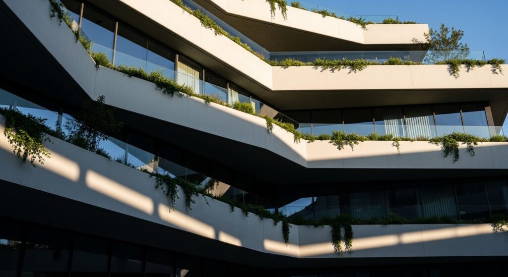
In architecture, the concept of stacked layers is often a direct response to both site and purpose. A building with a flat, monolithic facade can feel imposing and unwelcoming. In contrast, a structure that uses built-up sections—where elements like terraces, recessed windows, protruding volumes, and shadow lines are added in successive planes—invites exploration. It breaks down the scale, creates interplay of light and shadow, and establishes a rhythm.
Think of a classic Italian villa with a loggia receding behind arches, which then gives way to interior rooms. Or consider a modern museum where gallery wings are arranged in staggered blocks, creating courtyards and vistas between them. This layering achieves several key goals: it provides solar shading, enhances natural ventilation, creates private and public transitional zones, and, most importantly, crafts a journey. The viewer’s eye doesn’t stop at a flat wall; it travels inward, discovering new elements with each layer. The “back” here is the starting point—the foundational wall or the furthest plane—from which everything else is built forward.
Interior Spaces: Crafting Atmosphere with Receding Planes
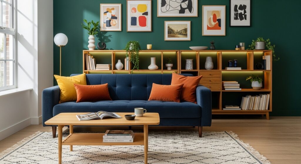
Translate this principle indoors, and you have the secret to deeply satisfying interior design. A room that feels “flat” lacks character and comfort. Designers combat this by consciously creating built-up sections, typically starting from the back wall and moving toward the room’s center.
Imagine a living room. The foundational back layer might be a painted wall. The next built-up section could be a floor-to-ceiling bookshelf or a panel of textured wood cladding. In front of that, you place a large sofa, which is itself a layered form. Then, a coffee table, and finally, an area rug that grounds the space. Each of these elements occupies its own visual plane. Lighting is then used to accentuate this stacking: wall washers highlight the back texture, a floor lamp illuminates the seating layer, and a pendant light focuses on the table layer. This creates a sense of enclosure and intimacy, making large rooms feel cozy and small rooms feel expansive and organized.
The Digital Landscape: UI/UX and the Z-Axis
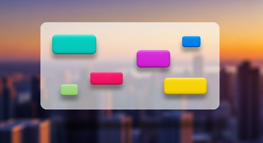
In the two-dimensional realm of screens, creating the illusion of depth is paramount for usability and engagement. This is where the concept of built-up sections at the back becomes a cornerstone of UI/UX design. Designers use the z-axis—the conceptual axis representing depth—to stack visual elements like layers in Photoshop.
The background layer might be a soft gradient or blurred image. On top of that, you build the next section: perhaps a card or a container with a subtle drop shadow, making it appear to float. Then, on that card, you place buttons or input fields that have their own micro-layering with borders and highlights. This visual hierarchy, achieved through stacking, guides the user’s eye logically from the most important informational layer (the back content) to the primary interactive layer (the front buttons). It reduces cognitive load by grouping related functions and creates a tactile, intuitive experience. Parallax scrolling is a direct and dynamic application of this principle, where background and foreground layers move at different speeds, simulating a 3D effect.
Art and Photography: Directing the Viewer’s Gaze
Artists have been masters of layering long before the term “UX” existed. In painting, techniques like atmospheric perspective create depth by making distant elements (the back layers) less detailed, lower in contrast, and cooler in color. The artist builds the scene forward from that hazy background, adding sharper details and warmer tones with each successive layer to pull the viewer into the focal point.
Photography employs the same principle through composition. A photographer might use a foreground element, like a branch or a window frame, as the first layer. The subject occupies the middle layer, and a compelling background provides context and mood. This “sandwiching” of layers creates a narrative within a single frame. The “built-up section at the back” here is the carefully chosen backdrop that doesn’t compete with the subject but rather complements and enhances it, giving the image a sense of place and story.

Psychological Impact: Why Layered Design Feels Right
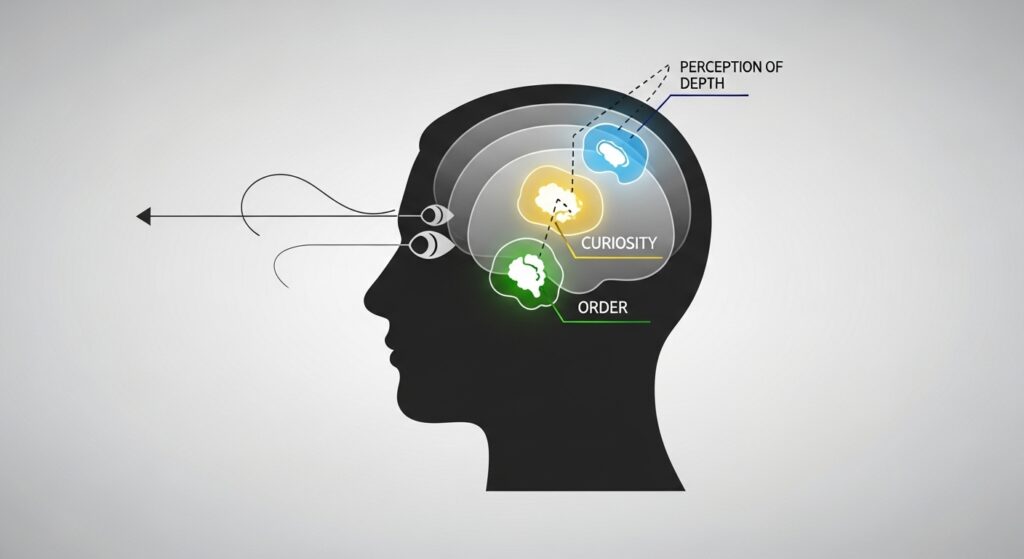
Why are we, as humans, so inherently drawn to layered compositions? The answer lies in how we perceive the world. Our binocular vision allows us to perceive depth by processing the slight differences between what our left and right eyes see. Layered designs mimic this natural reality. They provide visual cues—overlaps, shadows, size gradients—that our brain instinctively interprets as a three-dimensional environment.
This triggers a sense of curiosity and discovery. A flat surface can be understood instantly, but a layered one promises more to see. It invites us to linger, to look deeper, and to engage. In a spatial context, it can make us feel sheltered and secure, as layered elements often create niches and defined zones. In digital or graphic contexts, it creates clarity and reduces overwhelm by structuring information into digestible, grouped chunks. It’s a design language that speaks directly to our innate perception.
Implementing Stacked Layers in Your Projects
How can you actively use this principle? Start by thinking in planes. Whether you’re arranging a bookshelf, designing a presentation slide, or planning a garden, consciously identify your back, middle, and front layers.
For physical spaces: Begin with your back wall. Add texture, color, or shelving. Place your largest furniture item in front of it, then layer in smaller pieces and finally accessories. Use lighting vertically (sconces, floor lamps, overhead) to tie the layers together. For digital projects: Define your background first. Then, use containers with varying levels of shadow, opacity, or border to create distinct floating sections. Establish a strict z-index hierarchy in your CSS. Use color saturation and size to denote importance, with more saturated, larger elements feeling “closer.”
The key is intentionality. Avoid the temptation to let everything compete on the same visual plane. By building up from the back, you create a foundation that supports a more complex and rewarding composition.
Conclusion: The Depth of Good Design
The technique of stacked layers and built-up sections at the back is far more than a stylistic trend. It is a fundamental tool for creating meaningful depth. It transforms flat, static spaces and surfaces into dynamic, engaging experiences that resonate on a subconscious level. From the grand scale of a cityscape to the intimate scale of a smartphone screen, this principle helps organize chaos, guide attention, and evoke emotion.
So, the next time you find yourself captivated by a space, an image, or an interface, take a moment to deconstruct it. Look for the layers. Identify how the designer or architect started at the back and built forward. You’ll begin to see the world not as a collection of flat surfaces, but as a rich tapestry of interlocking planes—a testament to the power of building up, one deliberate section at a time.