Sliced Layers: Precision Cutting for Sharp Lines
In a world saturated with visual noise, clarity cuts through. There’s a particular power in a design defined by crisp, confident lines and distinct, separated layers. This isn’t about soft blends or gentle gradients; it’s about intentional separation, surgical precision, and the compelling visual tension that comes from elements that sit beside each other with exacting boundaries. This aesthetic, which we’re calling “Sliced Layers,” is a philosophy and a technical practice. It’s the art of using precision cutting—both as a digital metaphor and a physical technique—to create work that feels sharp, modern, and undeniably intentional.

The Philosophy of the Cut: More Than Just an Edge
At its core, the sliced layer technique is about creating definition through separation. It’s a deliberate act of dividing space, color, and form. Think of it as visual architecture. Instead of allowing elements to bleed into one another, you construct them as distinct planes that interact along defined seams. This approach fosters readability, hierarchy, and a sense of order.
The psychological impact is significant. Sharp lines and clean layers convey confidence, efficiency, and modernity. They suggest a maker in full control of their tools and vision. In user interface design, this translates to intuitive navigation. In print design, it commands attention. In fine art, it creates intriguing spatial relationships and depth. The “cut” becomes the active verb in your design process, a purposeful decision that guides the viewer’s eye with authority.

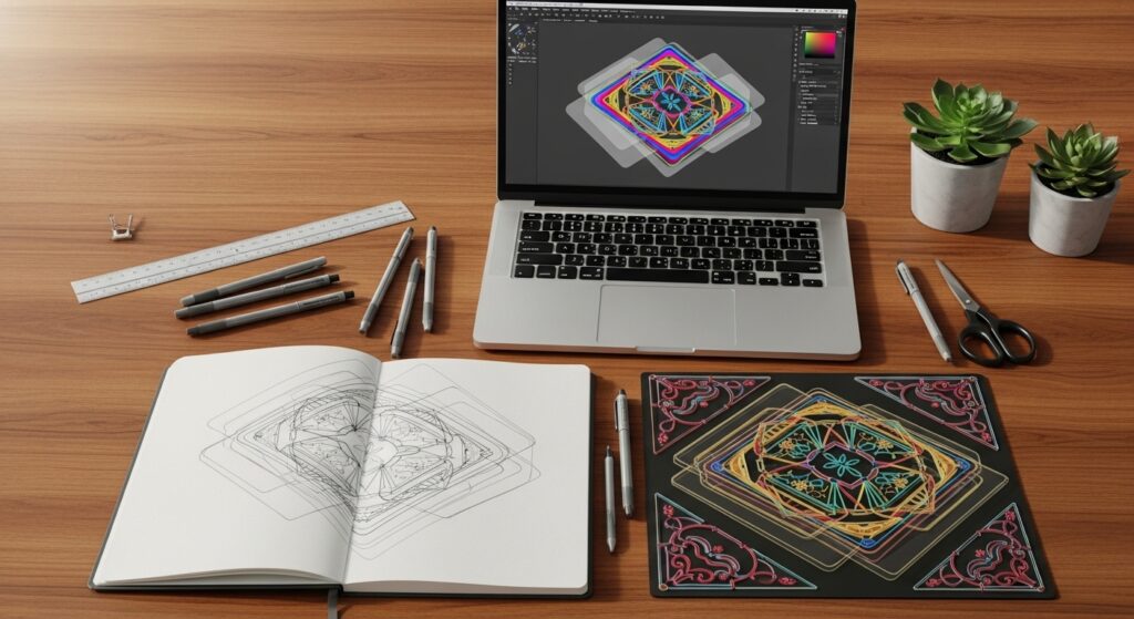
Digital Scalpels: Tools and Techniques for Pixel-Perfect Precision
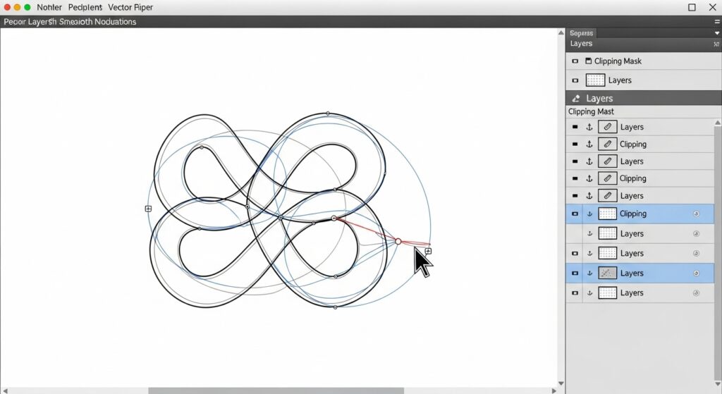
In the digital realm, “precision cutting” is achieved through a mastery of tools that function as your scalpel. The cornerstone technique is the use of clipping masks and vector paths. Rather than erasing, you use a defined shape (a vector path) to hide and reveal portions of a layer with absolute mathematical precision. This non-destructive method ensures your edges remain sharp at any scale.
Software like Adobe Illustrator is built for this, with the Pen Tool being your best friend. In Photoshop, mastering the Pen Tool for selections, or utilizing the vector mask functionality, is key. For UI/UX designers in tools like Figma or Sketch, it’s about leveraging boolean operations (union, subtract, intersect) to build complex shapes from simple ones with perfect edges. The critical habit to develop is zooming in—way in—to check those pixel edges. Anti-aliasing settings matter, and sometimes, positioning elements on whole pixel coordinates is necessary to avoid fuzzy sub-pixel rendering.
From Screen to Substance: Physical Manifestations of Sliced Layers
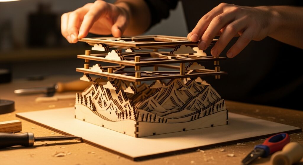
The principle thrillingly jumps from screen to reality. Here, precision cutting involves literal blades and meticulous craftsmanship. Vinyl cutting, laser cutting, and die-cutting are the industrial counterparts to the digital clipping mask. A graphic designed with sliced layers can be translated into a stunning vinyl decal, where each color is a separate piece of material weeded and applied.
Laser cutting allows this to happen in materials like wood, acrylic, and paper, creating layered artworks or functional objects with incredible detail. The key in physical execution is accounting for the materiality of the cut—the width of the laser kerf, the slight bevel of a blade, or the thickness of a layer that casts a shadow. These physical nuances add a rich, tangible depth that pure digital work can only suggest. The planning, however, remains rooted in the same digital philosophy: perfectly aligned vector paths that will guide the machine.
The Role of Negative Space: The Uncut Canvas
You cannot discuss sharp lines without honoring what makes them visible: negative space. The space between your layers is as active a design element as the layers themselves. It’s the pause that gives the note rhythm. Effective use of negative space—often called “white space” regardless of color—prevents visual clutter and allows each sliced layer to breathe and assert its individuality.
When planning your composition, consider the negative space as a shape in its own right. Is it consistent? Does it create a flowing path for the eye? A well-proportioned gutter between elements can feel just as precise and intentional as the elements it separates. This conscious management of emptiness is what transforms a group of cut layers from a busy collage into a harmonious and sophisticated composition.

Mastering the Illusion of Depth with Flat Planes
A common misconception is that sharp, flat layers result in a flat, boring design. The opposite is true. Precision cutting is a powerful tool for creating dynamic depth. By strategically overlapping layers, using color and value contrast, and employing subtle shadows, you can build a striking sense of dimension. Think of it like constructing a stage set from flat backdrops.
A darker layer behind a brighter one recedes. A small shadow offset from a layer instantly makes it “float” above the one below. This “flat depth” is a hallmark of much contemporary design, from isometric illustrations to layered UI cards. The depth is suggested and structured, not photorealistic, which aligns perfectly with the overall aesthetic of clarity and intention. Each layer occupies a distinct visual plane, and the relationship between those planes tells a spatial story.

Putting It Into Practice: A Workflow for Sharper Results
How do you integrate this into your process? Start with planning and structure. Before you even open a software, sketch out your composition in terms of distinct layers. Assign each a position in the stack. When you move digital, name your layers logically and use groups religiously. Employ grids and alignment tools with rigor; almost nothing undermines sharp lines faster than misaligned elements.
For physical projects, communication with your printer or fabricator is key. Provide clean, outlined vector files. Discuss bleed and trim lines. Understand the limitations of their cutting tools. Finally, embrace iteration. The beauty of non-destructive, layer-based work is the ability to experiment with the order, color, and spacing of your slices until the composition sings with clarity and impact.
Conclusion: The Cutting Edge as a Creative Choice
The pursuit of sliced layers and precision cutting is more than a technical exercise; it’s a commitment to clarity and purpose in your visual communication. In an era where we are constantly bombarded with imagery, work that exhibits controlled, sharp delineation stands apart. It feels resolved, professional, and potent.
Whether your medium is pixels, paper, or plywood, the principles remain universal: define your planes, honor the spaces between them, and execute with precision. By wielding your digital or physical scalpel with intent, you create work that doesn’t just whisper but declares itself with every sharp, clean line. So, challenge yourself: on your next project, make the cut. See how precision can set your creativity free.